


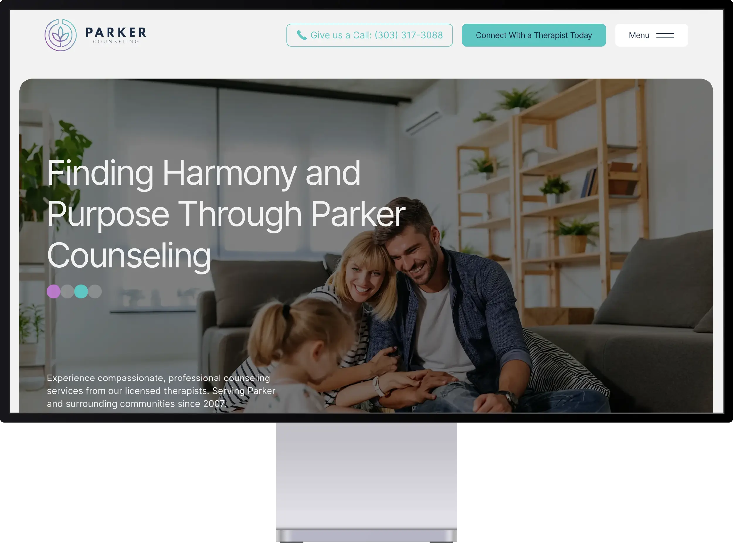
My Role
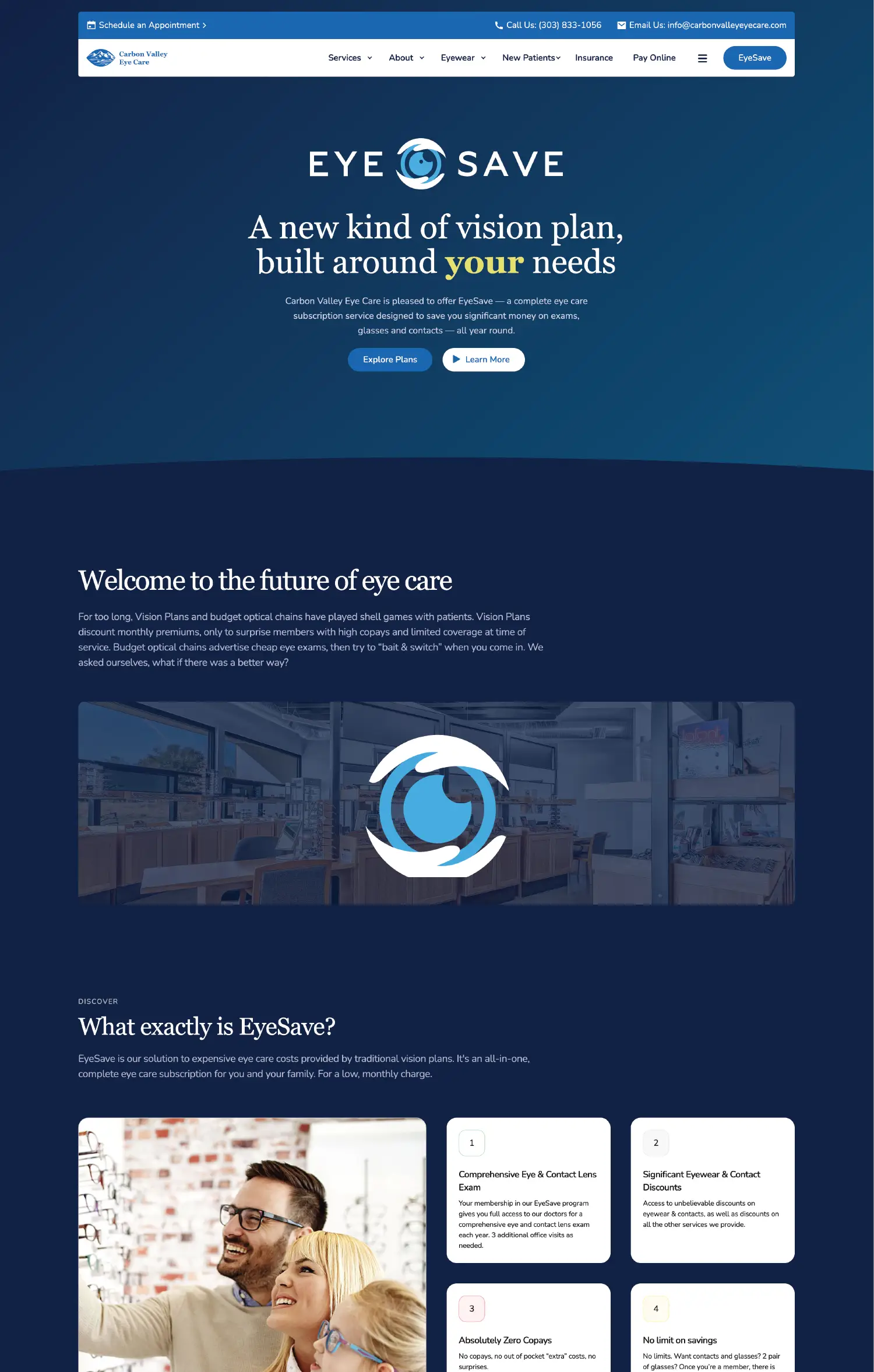
I led the complete redesign and development, transforming their outdated site into a modern healthcare platform. My work included user research to identify pain points, designing a scheduling-first interface, implementing custom animations, building the CMS for blogs and media updates, and creating the marketing site for their new EyeSave subscription service launch.
Challenges Faced
Designing an intuitive scheduling system that wouldn't intimidate less tech-savvy patients proved trickier than expected. The system needed to handle multiple providers, various appointment types, and insurance pre-verification while keeping the interface dead simple...because nobody wants to solve puzzles when their vision is already blurry.
Process & Discovery
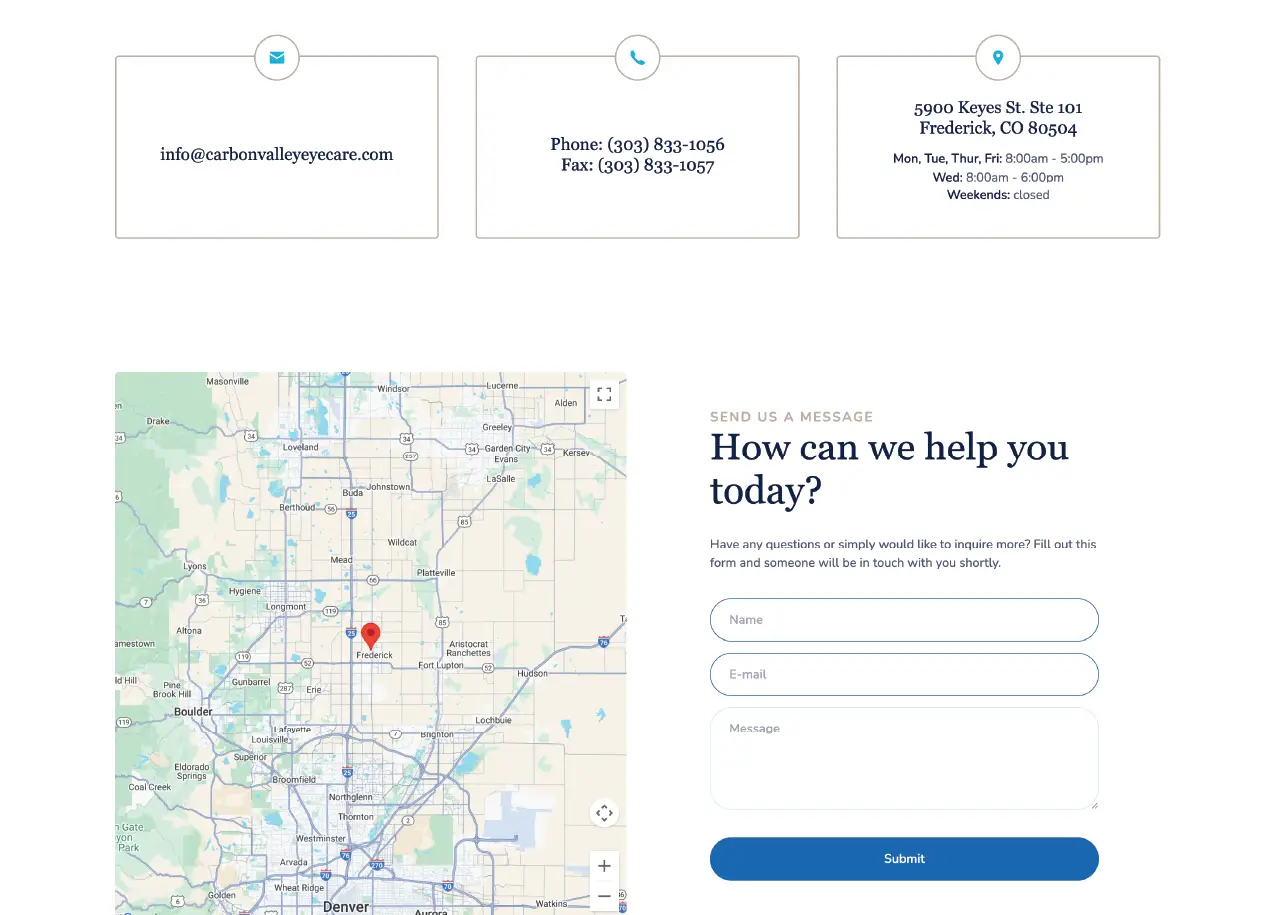
Research revealed that 70% of visitors came for one thing: scheduling appointments. Phone interviews with staff uncovered hours wasted on basic scheduling calls. I restructured the entire site hierarchy around this insight, making appointment booking accessible from every page within one click, while secondary services remained easily discoverable without cluttering the primary user path.


increase in monthly traffic
pages with streamlined navigation
subscription sign-ups within 3 months
average page load time to 1.8s

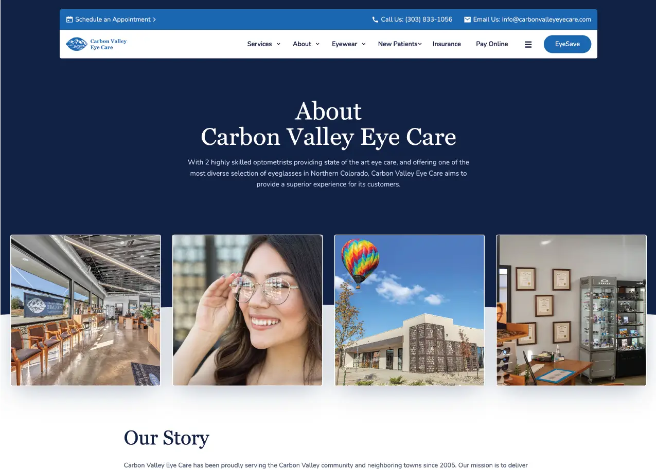
Design Overview
The design balances clinical professionalism with approachable warmth through a soft blue palette and rounded corners that feel less medical, more welcoming. Parallax effects add depth without causing motion sickness (ironic for an eye care site), while persistent CTAs for scheduling float elegantly as users scroll, never intrusive but always available when needed.
Technologies used


The results & business impact after site launch
The 20% traffic boost and 65% reduction in scheduling calls freed staff to focus on patient care rather than phone duty. The EyeSave subscription service gained 200+ members in its first quarter, directly attributed to the dedicated marketing page. Most importantly, patient feedback consistently mentions how easy scheduling became—a small victory that makes a huge difference when you're dealing with dilated pupils and can barely see your phone screen.
There's plenty more examples. Take a look at some others.
I'm passionate about building websites that work as hard as you do. Whether you need something built from scratch or want to rescue an existing site, I focus on creating experiences that look great and actually get results.
© 2026 Trujillo Consulting LLC dba truDesign. All rights reserved. Unauthorized use and/or duplication of this material without express and written permission from this site’s author and/or owner is strictly prohibited.
*All work showcased on this website was created by myself, Jacob Trujillo, and includes projects completed during my tenure at an agency. The views and opinions expressed on this site are those of the author and do not necessarily reflect the official policy or position of any other agency, organization, employer, or company.
†Clients mentioned on this site reflect work completed as part of my role at an agency. These projects are included to illustrate my personal contributions and expertise, not to imply direct individual client relationships.