


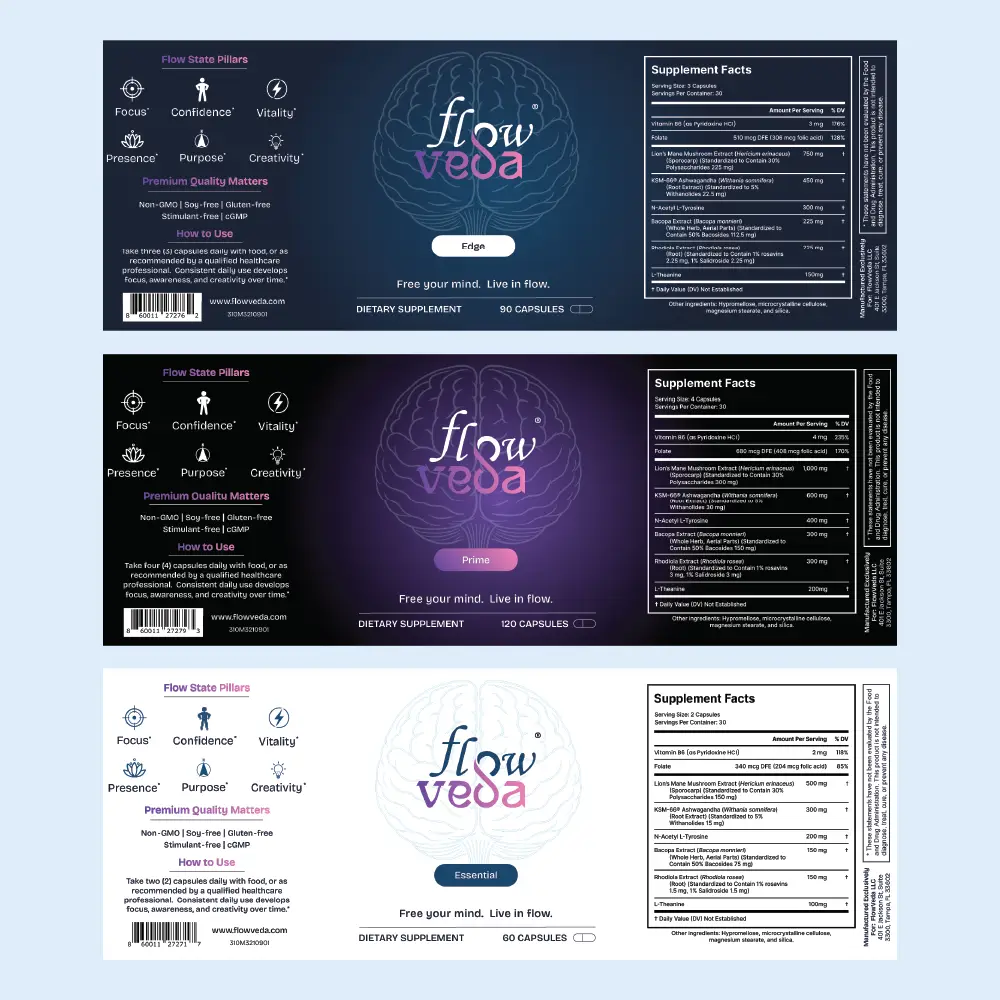
Strategic Product Architecture
Transformed a confusing metal-tier system (Silver/Gold/Platinum) into an intuitive progression—Essential, Edge, and Prime—clearly communicating dosage differences without implying quality disparities.
Minimal Design Approach
Analyzed competitor packaging to identify that less is more in the nootropic space, creating clean labels that balance required information with sophisticated restraint and visual breathing room.
Cohesive Variant System
Developed a color-coded theme for each variant while maintaining brand consistency, ensuring easy identification and selection for consumers at different dosage needs.


The results of the project and looking ahead
The rebrand successfully clarified FlowVeda's product line with three distinct labels featuring the new Essential, Edge, and Prime naming system. Each label incorporated unique color themes while maintaining minimal aesthetics that stood out against cluttered competitor packaging. Despite space constraints, the designs elegantly integrated supplement facts, benefits, and usage instructions without sacrificing visual clarity. The new naming architecture eliminated customer confusion and positioned each variant as equally premium, differentiated only by dosage needs.
Technologies used


There's plenty more examples. Take a look at some others.
I'm always interested in collaborating on meaningful design challenges. Feel free to reach out if you'd like to discuss your next project or just want to connect.


© 2026 Trujillo Consulting LLC dba truDesign. All rights reserved. Unauthorized use and/or duplication of this material without express and written permission from this site’s author and/or owner is strictly prohibited.
*All work showcased on this website was created by myself, Jacob Trujillo, and includes projects completed during my tenure at an agency. The views and opinions expressed on this site are those of the author and do not necessarily reflect the official policy or position of any other agency, organization, employer, or company.
†Clients mentioned on this site reflect work completed as part of my role at an agency. These projects are included to illustrate my personal contributions and expertise, not to imply direct individual client relationships.