

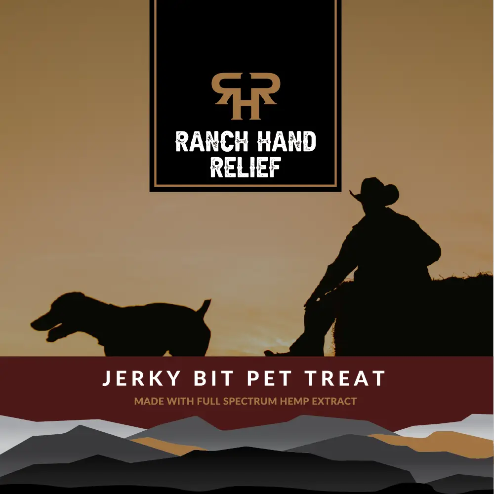
Authentic Ranch Heritage
Traveled to their Utah operation to understand the rancher ethos firsthand, translating their commitment to natural, quality pet care into visual design language that resonates with their story.
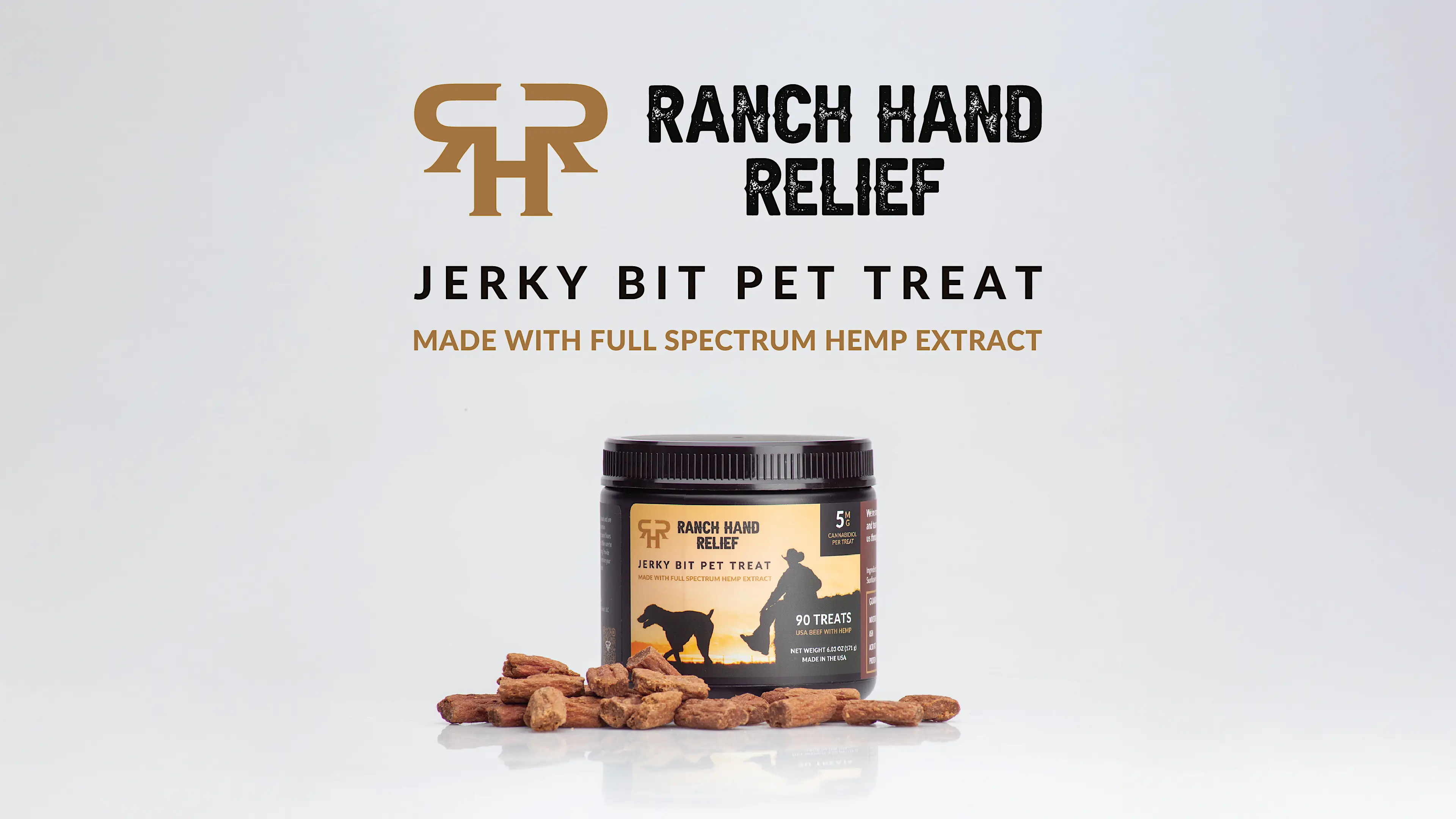
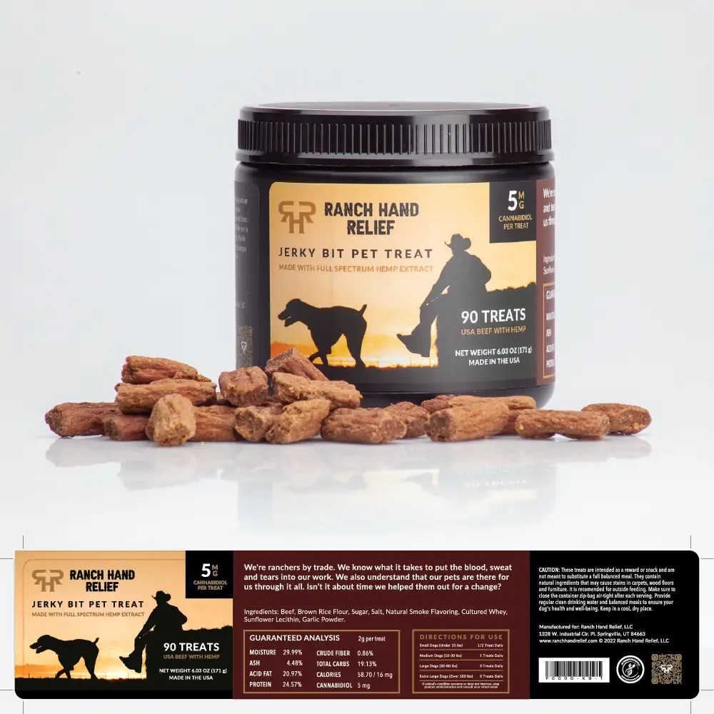
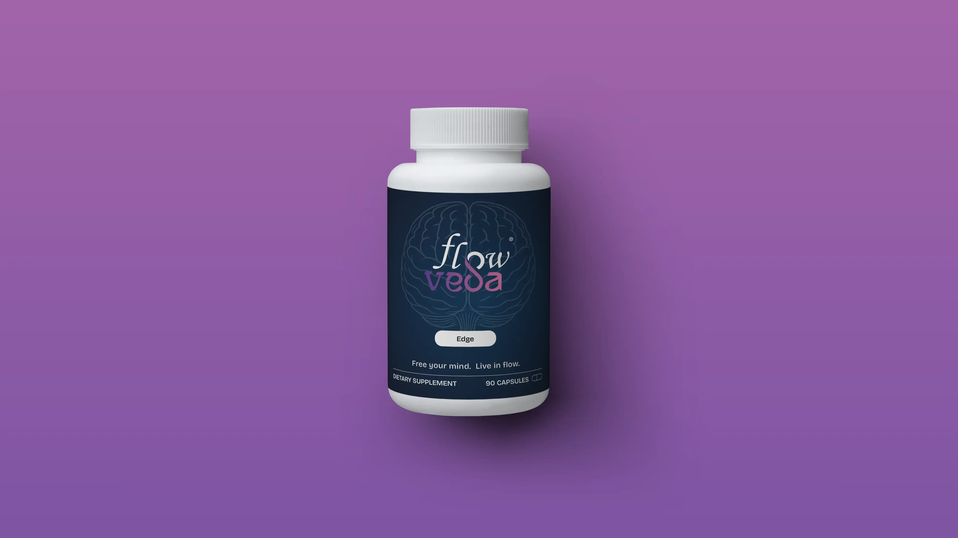
Premium Dark Aesthetic
Developed a sophisticated dark color palette with strategic brown hues, creating a "gritty" ranch feel that stands apart from typical bright, clinical pet supplement packaging.
Market Differentiation
Positioned Ranch Hand Relief as the authentic choice in a crowded CBD market by visually communicating their all-natural ingredients and rancher-backed quality through thoughtful design choices.

The results of the project and looking ahead
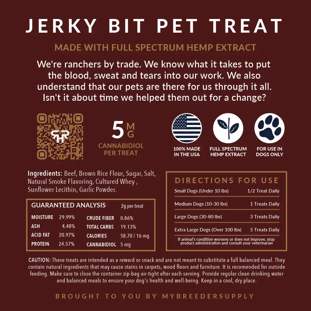
The final packaging design successfully captured Ranch Hand Relief's authentic rancher identity while establishing premium shelf presence. The dark aesthetic with brown undertones created the perfect "gritty" ranch feel that differentiated the product from competitors' clinical approaches. The design effectively communicated the brand's core values—all-natural ingredients, delicious taste, and genuine care for pets—through visual storytelling. This packaging helped Ranch Hand Relief enter the market with immediate credibility and appeal to pet owners seeking authentic, trustworthy CBD supplements.
Technologies used


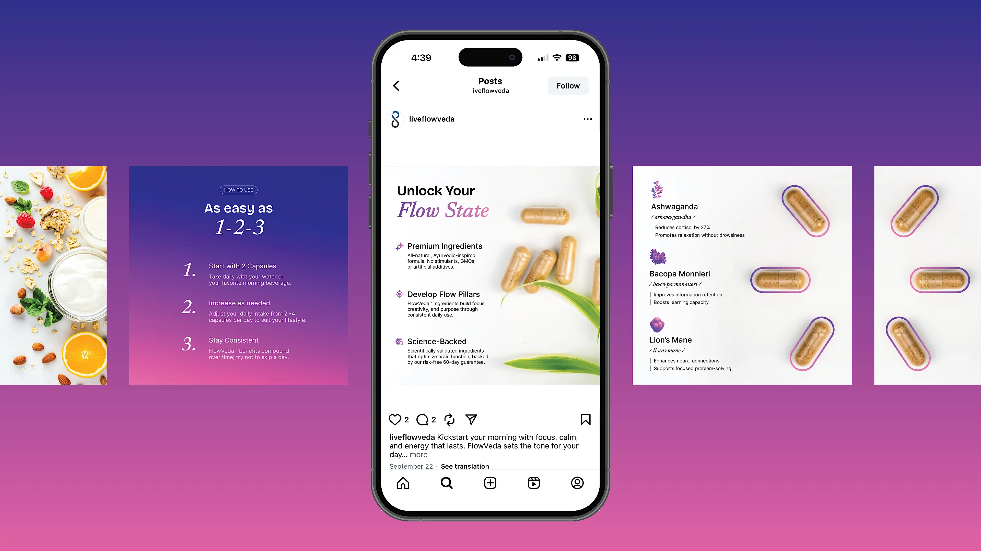
There's plenty more examples. Take a look at some others.
I'm always interested in collaborating on meaningful design challenges. Feel free to reach out if you'd like to discuss your next project or just want to connect.

© 2026 Trujillo Consulting LLC dba truDesign. All rights reserved. Unauthorized use and/or duplication of this material without express and written permission from this site’s author and/or owner is strictly prohibited.
*All work showcased on this website was created by myself, Jacob Trujillo, and includes projects completed during my tenure at an agency. The views and opinions expressed on this site are those of the author and do not necessarily reflect the official policy or position of any other agency, organization, employer, or company.
†Clients mentioned on this site reflect work completed as part of my role at an agency. These projects are included to illustrate my personal contributions and expertise, not to imply direct individual client relationships.