


Project Overview
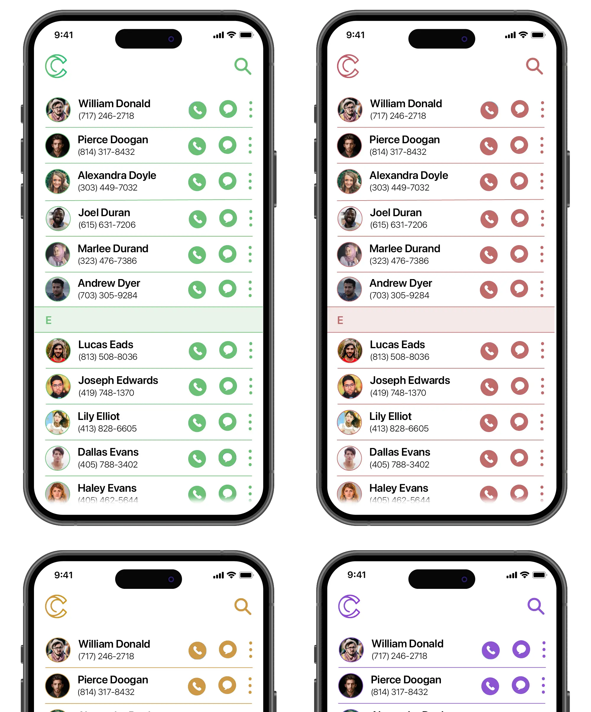
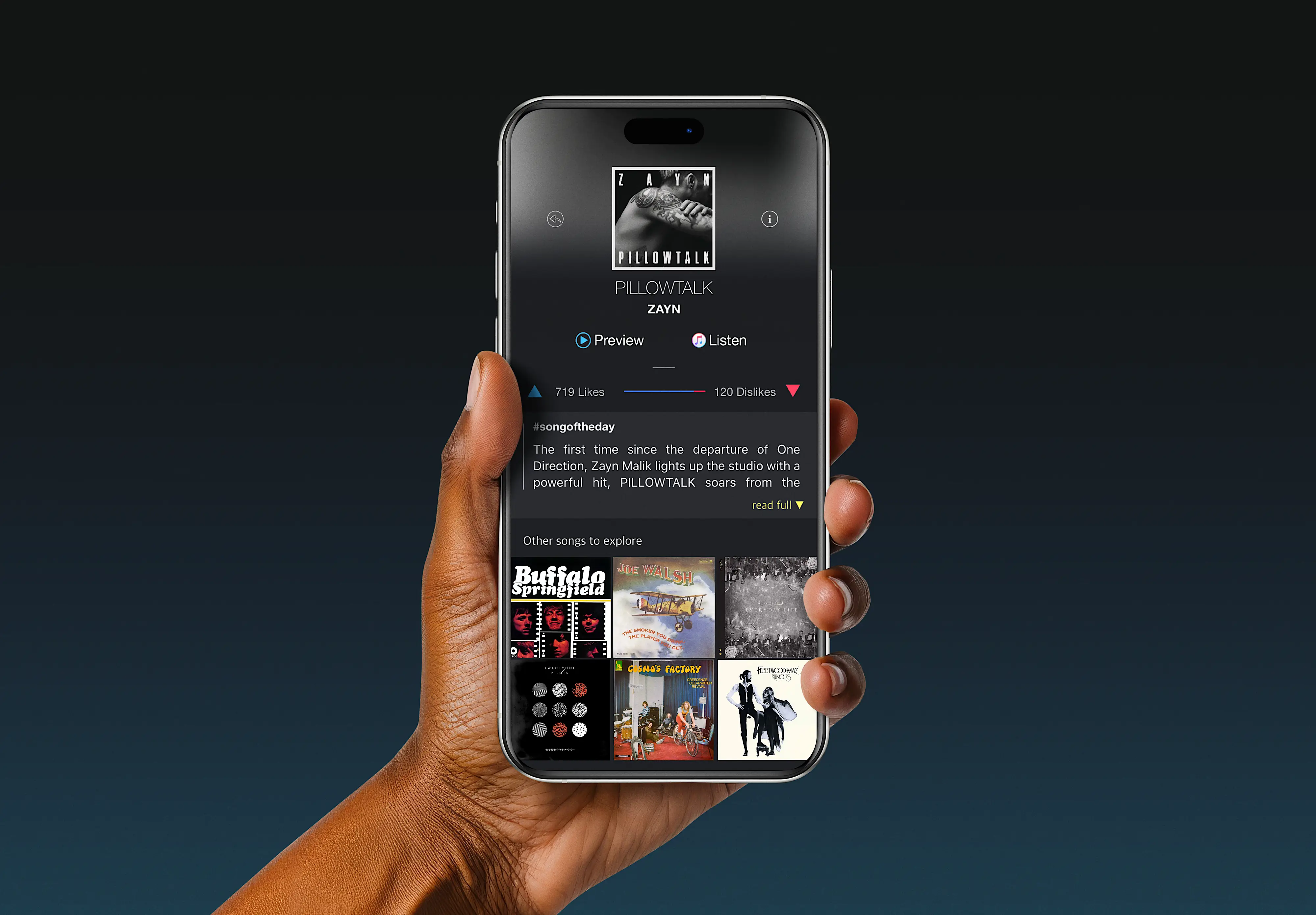
Circle started as a personal exploration into what Apple's native Contacts app could be if it actually evolved with how we manage relationships today. The core concept centers around "Circles" — smart groups that let you organize contacts the way you actually think about them. Not just family or work, but overlapping circles like "poker night crew" or "kids' soccer parents" where people naturally belong to multiple groups.
My Role
This was a passion project where I wore all the hats — researcher, designer, and prototyper. I designed the entire app experience from scratch, creating every screen, interaction, and micro-animation. To push myself further, I decided to learn Sketch specifically for this project, expanding my toolkit while bringing Circle to life.
User Research Insights
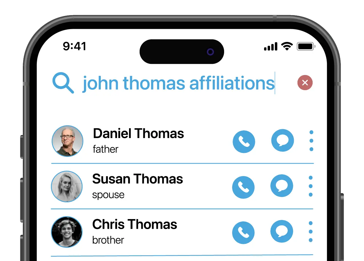
Looking at how people actually use their contacts revealed major gaps in Apple's approach. Users wanted advanced search that could find "that guy from the conference in Denver" without remembering his name. They wanted different view options — sometimes a grid of faces, sometimes a detailed list. Quick actions like edit, share, and delete required too many taps. Most importantly, Apple's rigid grouping system didn't match how people actually categorize their relationships.
Problem/Challenge
The main design challenge was adding powerful features without losing the simplicity that makes Apple's apps approachable. Every new feature risked cluttering the interface. On the technical side, I had to learn an entirely new platform — Sketch — for both the design and prototyping work, which meant figuring out new workflows and capabilities while designing.

Design Approach
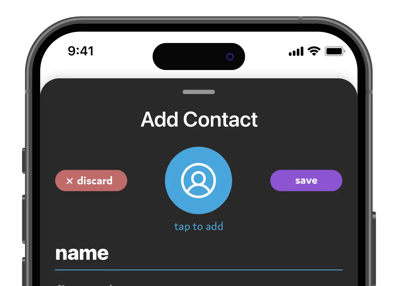
I kept Apple's clean aesthetic but pushed it forward with more dynamic interactions. Circles became the visual anchor — appearing as overlapping groups in the UI that users could tap into or combine. Advanced search got its own intelligent interface that suggested search parameters. Quick actions used familiar iOS gestures but in new contexts, making power features discoverable without tutorials.

The results of the project and looking ahead
The final prototype was a fully interactive experience built entirely in Sketch. Testers could navigate through the app as if it were live — creating circles, adding contacts to multiple groups, using advanced search, and accessing quick actions with natural gestures. Circle demonstrated how a native app could evolve while still feeling unmistakably Apple, just significantly more powerful.
Technologies used


There's plenty more examples. Take a look at some others.
Complex problems deserve thoughtful solutions. I specialize in turning frustrating workflows into intuitive experiences, bringing clarity to cluttered interfaces, and making sure every click counts toward your goals.
© 2026 Trujillo Consulting LLC dba truDesign. All rights reserved. Unauthorized use and/or duplication of this material without express and written permission from this site’s author and/or owner is strictly prohibited.
*All work showcased on this website was created by myself, Jacob Trujillo, and includes projects completed during my tenure at an agency. The views and opinions expressed on this site are those of the author and do not necessarily reflect the official policy or position of any other agency, organization, employer, or company.
†Clients mentioned on this site reflect work completed as part of my role at an agency. These projects are included to illustrate my personal contributions and expertise, not to imply direct individual client relationships.