

Project Overview
Notelife was born from frustration with cluttered note-taking apps that got in the way of actual note-taking. Growing up taking digital notes in school, I constantly fought against busy interfaces that made simple tasks complicated. Notelife flips the script — putting your content front and center while keeping the tools accessible but invisible until you need them.
My Role
As a personal project, I handled the complete product design from concept through final prototype. This included information architecture for organizing notes, interaction design for the study and focus modes, and creating a comprehensive design system that balanced minimalism with functionality. Every screen, animation, and micro-interaction was crafted to support distraction-free note-taking.
User Research Insights
Students and professionals shared similar pain points: existing apps either overwhelmed with features or were too basic to be useful. Users constantly switched between note-taking and study apps, losing context and time. They wanted powerful formatting without Microsoft Word's toolbar chaos. Most importantly, they needed their notes to transform into study materials without copying everything into flashcard apps.
Problem/Challenge
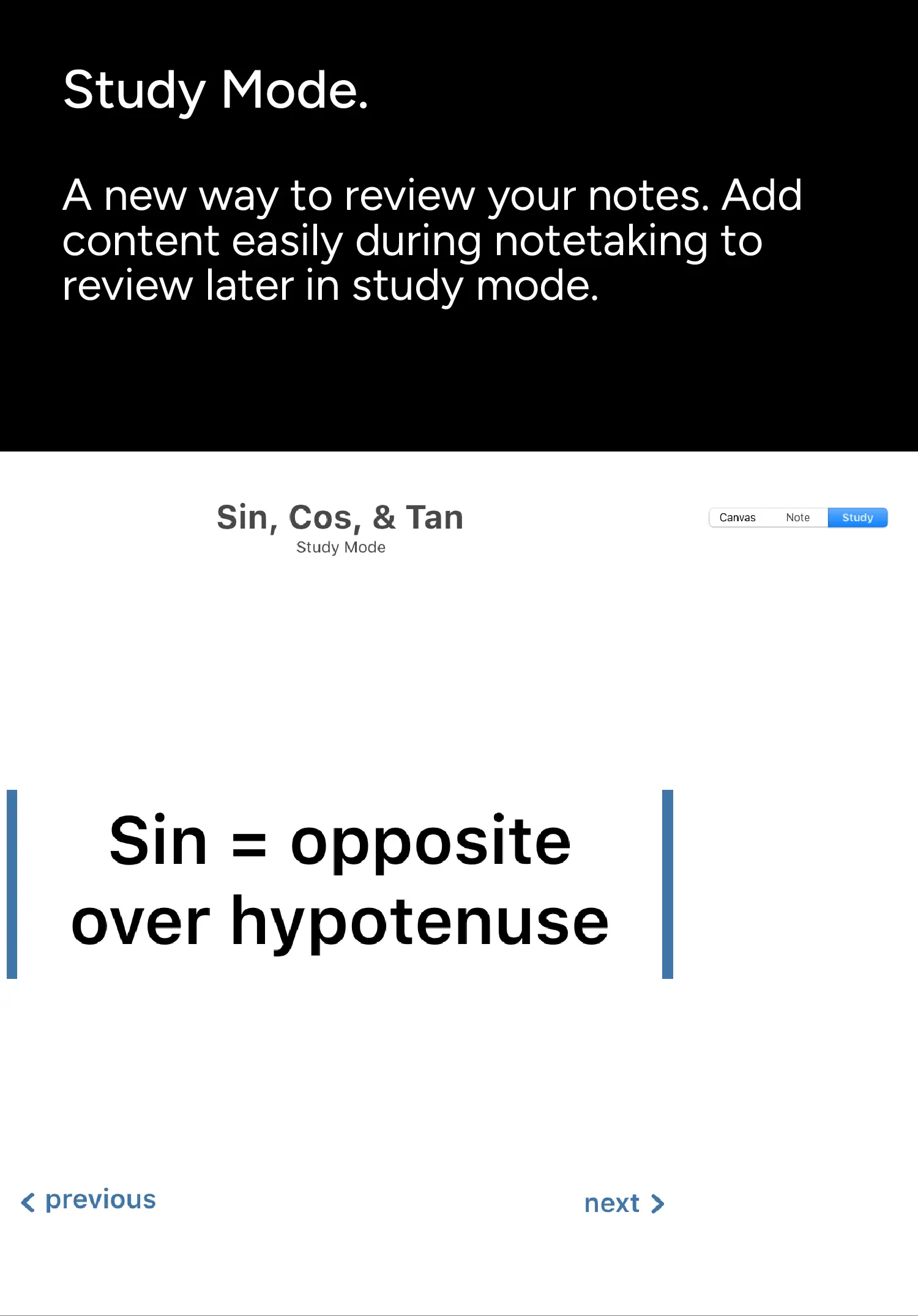
The core challenge was achieving true minimalism without sacrificing functionality. How do you include rich formatting, organization systems, and innovative features like study mode while maintaining a clean interface? Every element had to earn its place on screen. The study mode feature particularly pushed me to rethink how notes could be more than static text.
Design Approach
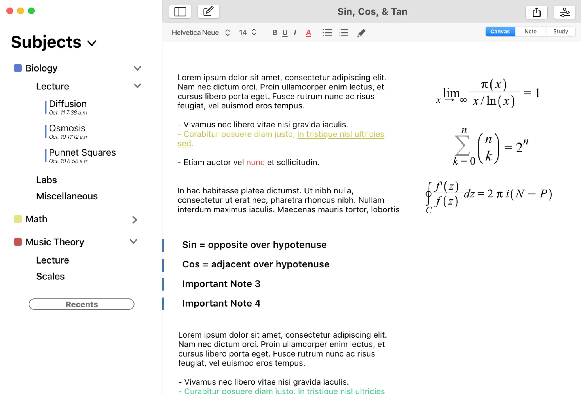
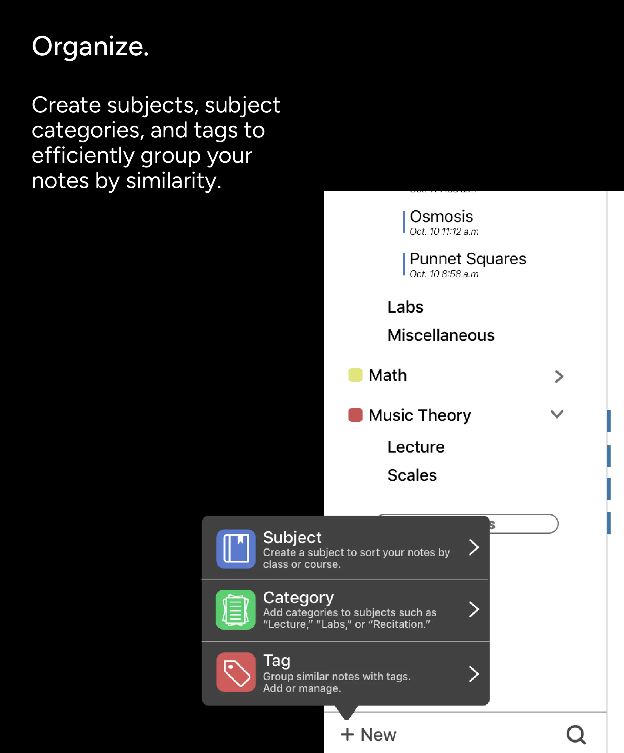
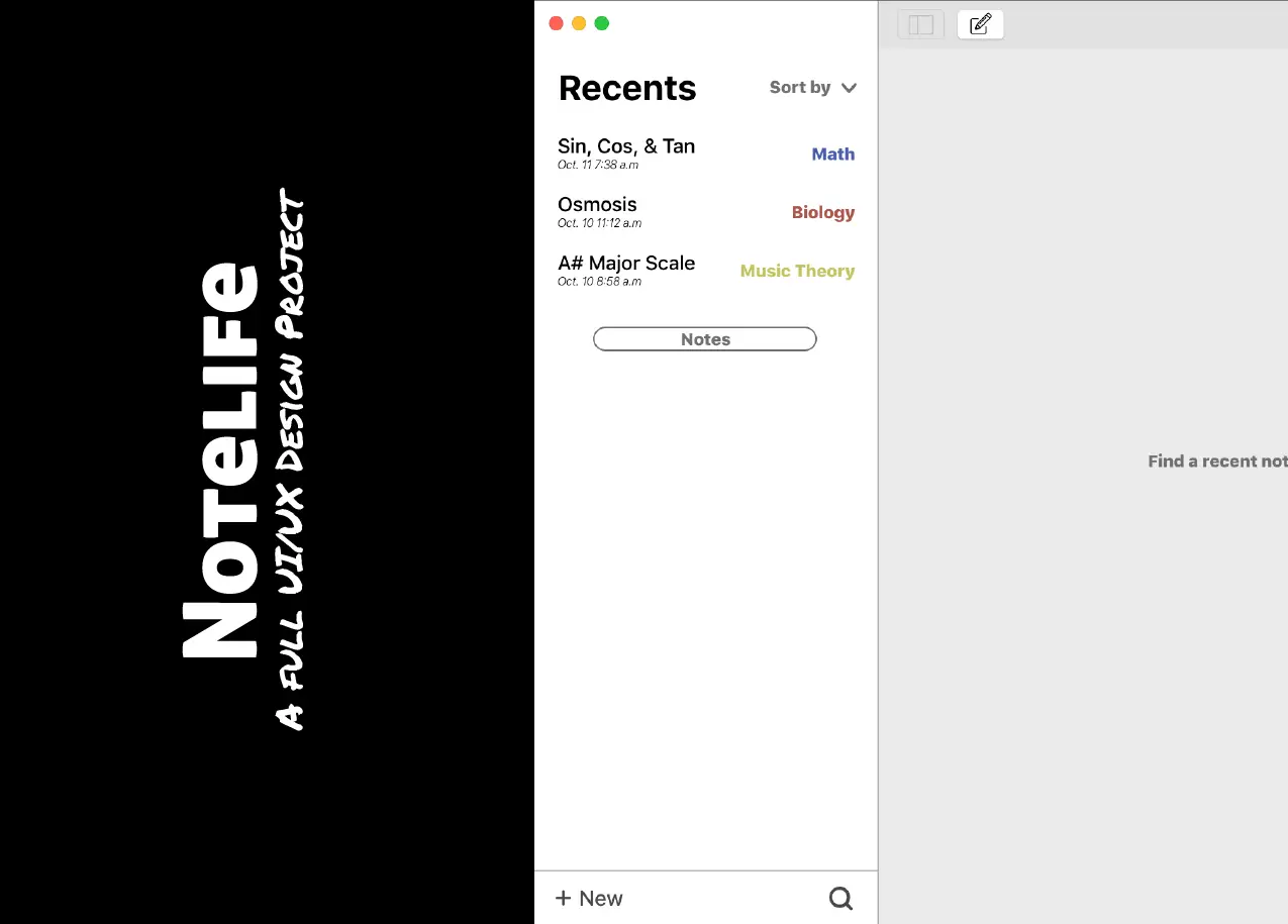
I embraced radical minimalism — interface elements only appeared on hover or when contextually relevant. The color palette stayed monochromatic with small accent colors for organization. Study mode used subtle animations to transform note blocks into interactive flashcards. Focus mode took minimalism further, stripping away everything except essential writing tools, creating a truly distraction-free environment.

The results of the project and looking ahead
The final Sketch prototype delivered a complete note-taking ecosystem that proved less really can be more. Users could organize with subjects, categories, and tags without visual clutter. Rich formatting tools stayed hidden until needed. Study mode seamlessly converted notes into quiz materials, while focus mode created a zen-like writing experience. Notelife showed that powerful functionality and minimalist design aren't mutually exclusive — they're perfect partners.
Technologies used


There's plenty more examples. Take a look at some others.
Complex problems deserve thoughtful solutions. I specialize in turning frustrating workflows into intuitive experiences, bringing clarity to cluttered interfaces, and making sure every click counts toward your goals.

© 2026 Trujillo Consulting LLC dba truDesign. All rights reserved. Unauthorized use and/or duplication of this material without express and written permission from this site’s author and/or owner is strictly prohibited.
*All work showcased on this website was created by myself, Jacob Trujillo, and includes projects completed during my tenure at an agency. The views and opinions expressed on this site are those of the author and do not necessarily reflect the official policy or position of any other agency, organization, employer, or company.
†Clients mentioned on this site reflect work completed as part of my role at an agency. These projects are included to illustrate my personal contributions and expertise, not to imply direct individual client relationships.