


Project Overview
Dana Safety Supply had a problem. As a law enforcement and safety product distributor, they needed their e-commerce platform to handle very specific government requirements and restrictions. Their existing BigCommerce setup technically worked, but it was held together by expensive third-party band-aids and workarounds that made their team's daily operations feel like navigating an obstacle course.
Enter DECA (Dana E-Commerce Application) — a completely reimagined platform built from the ground up to do exactly what DSS needed, nothing more, nothing less.
My Role
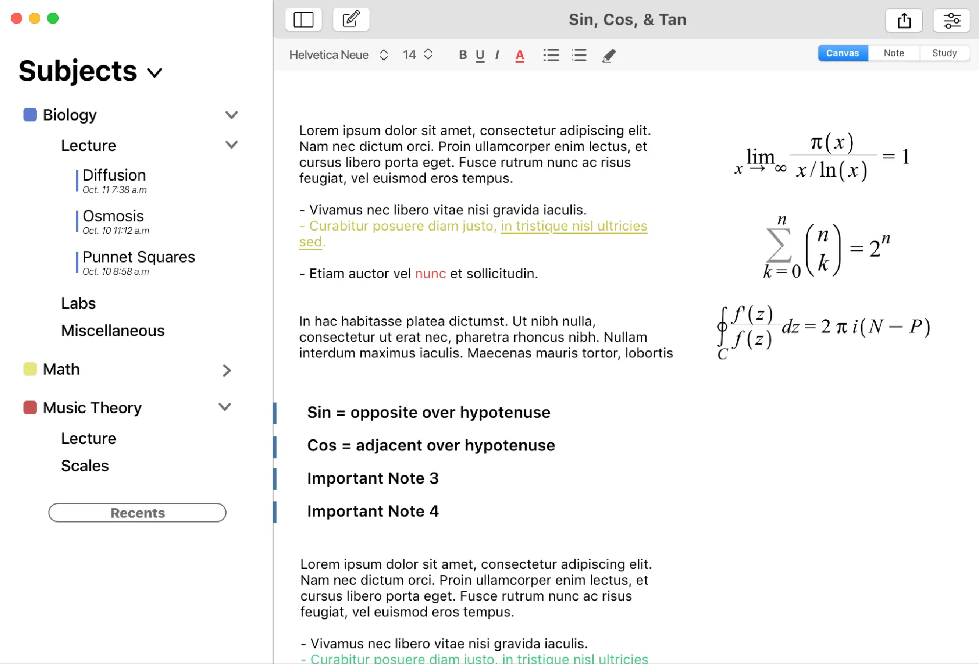
As the sole designer on this project, I owned the entire backend design from concept to launch. Every UI element, page, screen, modal, and component came across my desk. I developed DECA's visual identity with one north star: legibility above all else. This wasn't about being flashy — it was about creating something DSS's team could use efficiently every single day.
I spent my time studying BigCommerce's common pain points and reimagining how those workflows could actually work. The best part? I had complete creative freedom to design the right solution, as long as it fit within DSS's specifications.
User Research Insights
The DSS team managing their existing backend had plenty to say, and I was all ears. Their biggest frustrations centered around two critical workflows:
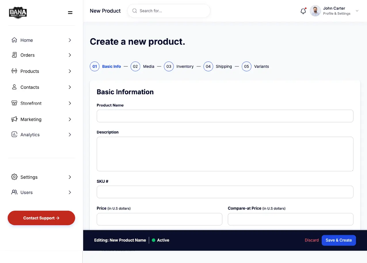
- Product creation was tedious — Adding new products required jumping through multiple screens and redundant data entry
- Bulk modifications were a nightmare — Need to update pricing on 100 items? Hope you cleared your afternoon
- Government restrictions required constant workarounds — Features that should be simple became complex due to compliance needs
- The interface fought against them — Instead of supporting their workflow, they had to adapt to BigCommerce's way of doing things
Problem/Challenge
Based on these insights, the core challenge became clear: design a backend system that treats DSS's unique requirements as features, not edge cases. This meant rethinking standard e-commerce patterns to prioritize bulk operations, streamline product management, and bake government compliance directly into the interface — all while keeping it intuitive enough that their team wouldn't need extensive training.
Design Approach
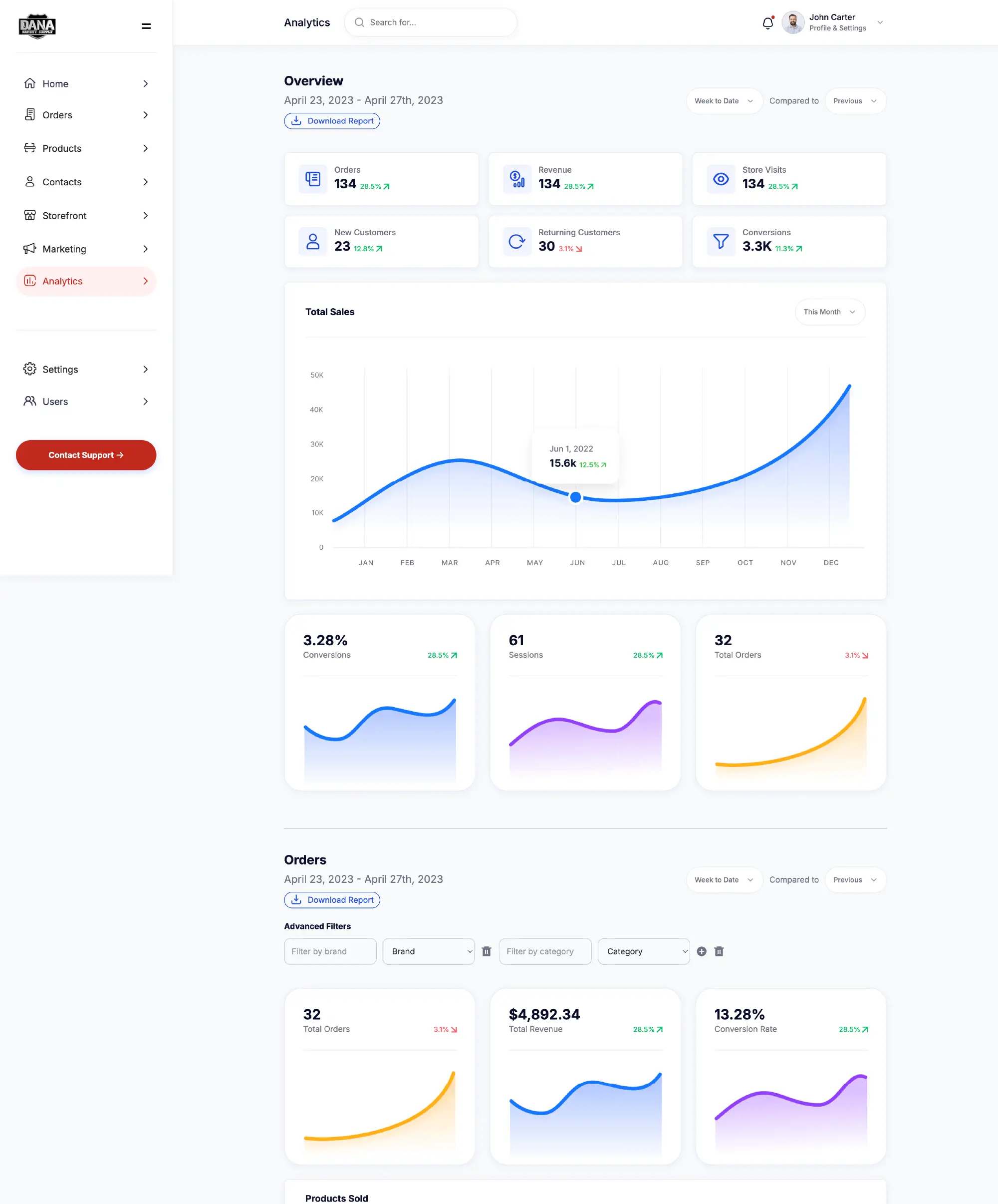
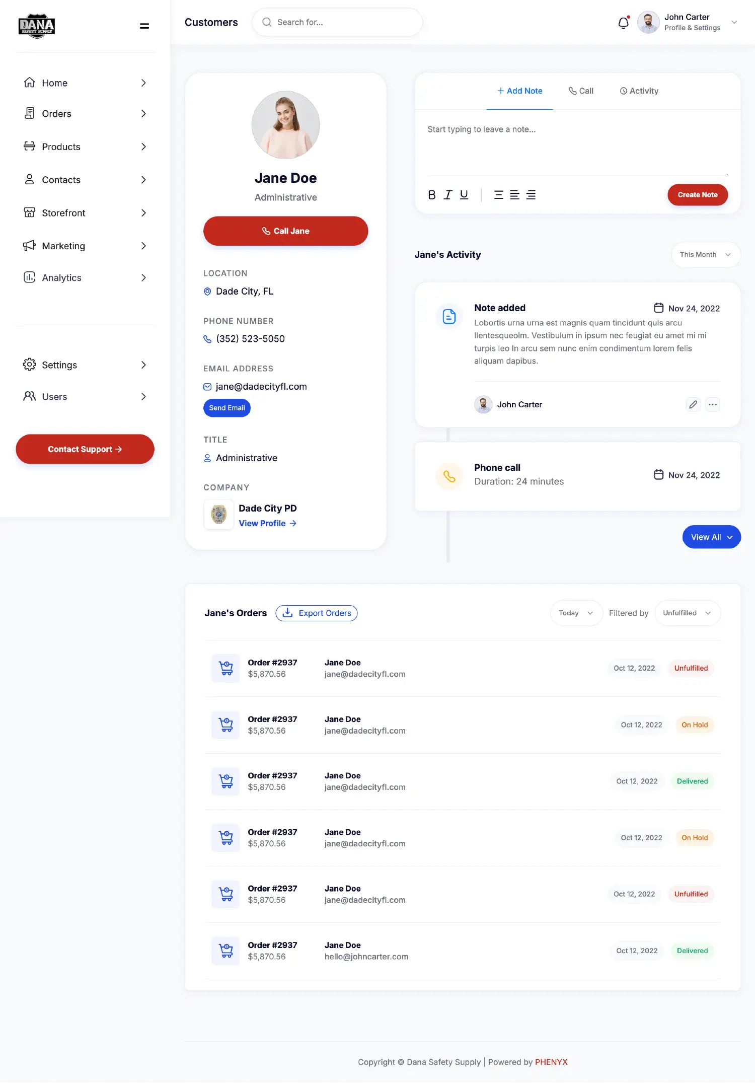
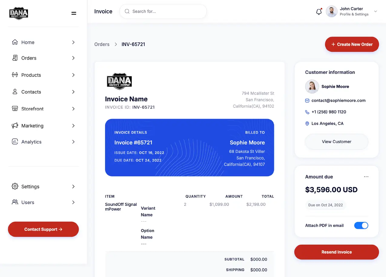
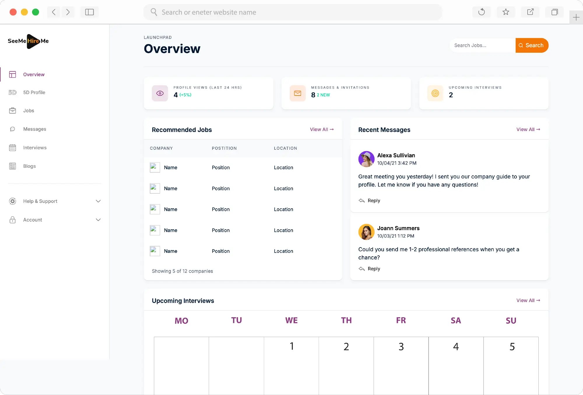
I approached DECA's design by flipping the script on traditional e-commerce backends. Instead of forcing users to work page by page, I designed powerful bulk editing tools front and center. Modal workflows kept users in context while making changes. The component system was built for clarity — high contrast, generous spacing, and clear typography that wouldn't cause eye strain during those long inventory update sessions.
Every design decision asked one question: "Will this make the DSS team's day easier or harder?"

The results of the project and looking ahead
After 6 months of design work and another 6 months of development and refinement, DECA launched successfully. The DSS team went from fighting their tools to actually enjoying their workflow. Tasks that took hours now took minutes.
But here's the kicker — we built DECA with the future in mind. The platform's modular design means it can be white-labeled and adapted for other businesses struggling with similar custom e-commerce needs. What started as a solution for one company became a potential product for many.
Technologies used


There's plenty more examples. Take a look at some others.
Complex problems deserve thoughtful solutions. I specialize in turning frustrating workflows into intuitive experiences, bringing clarity to cluttered interfaces, and making sure every click counts toward your goals.


© 2026 Trujillo Consulting LLC dba truDesign. All rights reserved. Unauthorized use and/or duplication of this material without express and written permission from this site’s author and/or owner is strictly prohibited.
*All work showcased on this website was created by myself, Jacob Trujillo, and includes projects completed during my tenure at an agency. The views and opinions expressed on this site are those of the author and do not necessarily reflect the official policy or position of any other agency, organization, employer, or company.
†Clients mentioned on this site reflect work completed as part of my role at an agency. These projects are included to illustrate my personal contributions and expertise, not to imply direct individual client relationships.